> For the complete documentation index, see [llms.txt](https://help.byinspiredlabs.com/llms.txt). Markdown versions of documentation pages are available by appending `.md` to page URLs; this page is available as [Markdown](https://help.byinspiredlabs.com/collection-page/collection-banner.md).
# Collection banner
Collection pages display products grouped into collections in a grid format, offering a structured way for customers to browse products. Customizing these pages allows you to highlight featured content, improve navigation with filters, and insert promotions for a more engaging shopping experience.
The collection banner's primary purpose is to provide context, branding, and a clear introduction to the collection. It creates an impactful first impression and encourages customers to explore the products further.
### **1. How to add a description or image to your collection?**
To add a description or featured image to a collection banner, follow these steps:
{% stepper %}
{% step %}
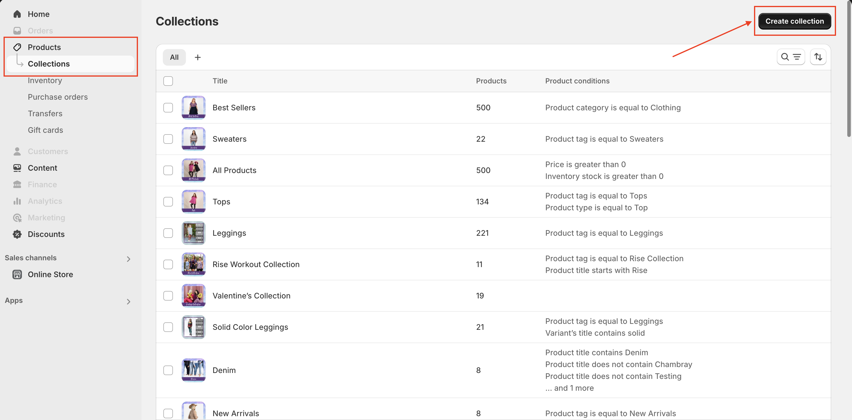
From your Shopify admin, go to **Products > Collections**.
{% endstep %}
{% step %}
Select an existing collection or click **Create collection** to create a new one.
{% endstep %}
{% step %}
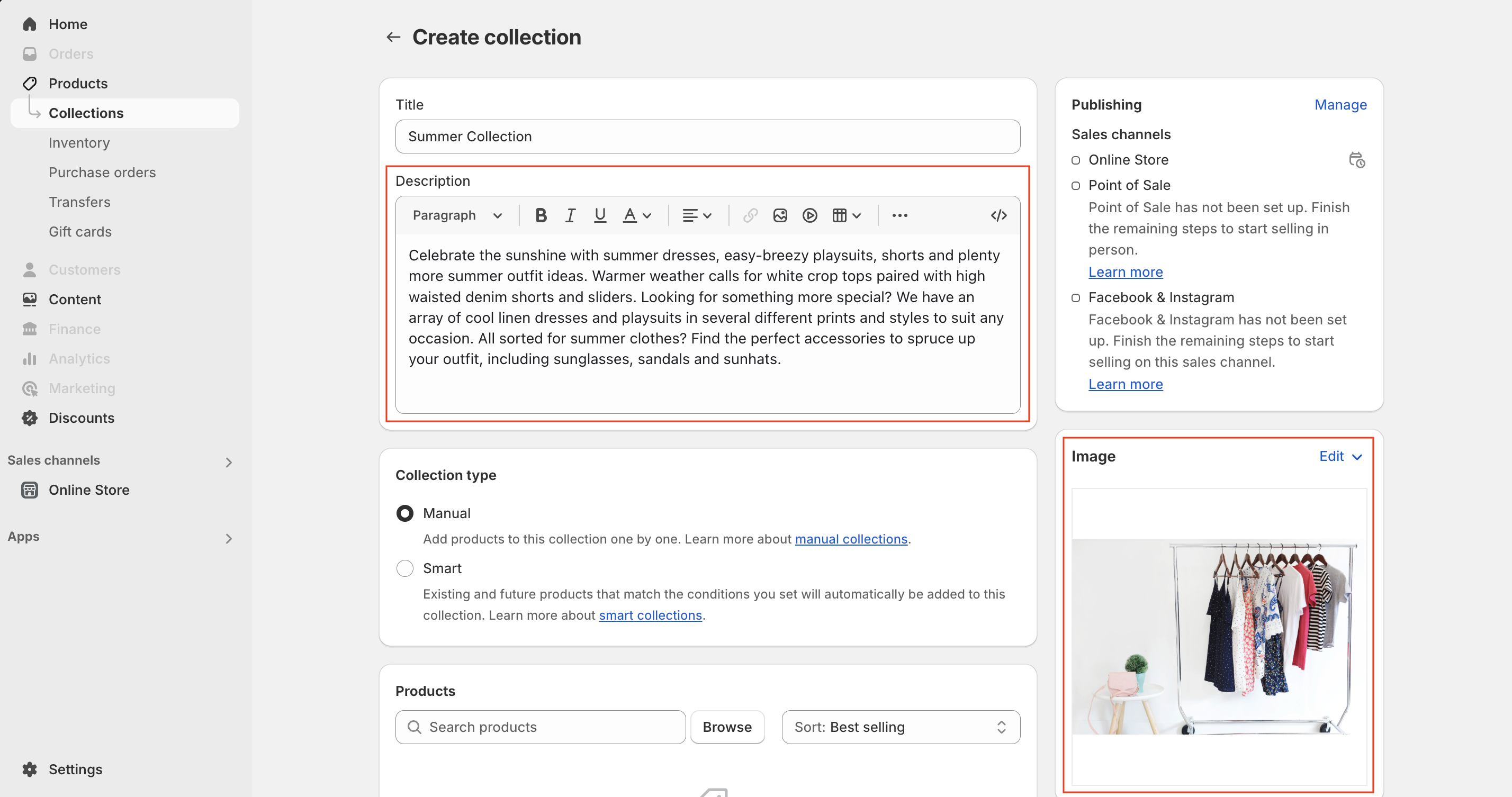
On the collection details page: Enter a new **description** in the "Description" field. Click **Add image** to upload a featured image.
{% endstep %}
{% step %}
Click **Save** to apply the changes.
*The image and description will now display within the **Collection banner** section.*
{% endstep %}
{% endstepper %}
### **2. Collection banner section settings:**
* **Show breadcrumbs:** When checked, breadcrumbs will be displayed on the collection page. This helps customers navigate back to previous pages.
* **Show collection image:** Determines whether the collection image (uploaded in Shopify admin) will display. Use a 16:9 aspect ratio for optimal results.
* **Image:** Upload a custom image to replace the default collection image.
* **Desktop banner height:**
* **Adapt to image size:** Displays the original image size without adjustments.
* **Small:** Compact banner for minimal content.
* **Medium:** Balanced size for images and text.
* **Large:** Prominent banner height to highlight visuals.
* **Desktop content alignment:** Aligns the title and description content: Left, Center or Right.
* **Desktop content width**: Adjusts the width of the content area inside the banner with options: *Small, Medium, Large.*
* **Mobile layout:**
* **Show collection image on mobile**: If enabled, the collection image will be displayed on mobile.
* **Mobile banner height:** Adjusts the height of the banner image for mobile devices from Small to Large. With "**Adapt to image size":** Retains the original image dimensions.
* **Mobile content alignment:** Aligns the collection title and description horizontally on mobile screens: Left, Center or Right.
### **3. Collection title block settings:**
The **Collection title block** controls the display of the collection title within the banner section. This block must be added for the title to appear.
**Settings:**
* **Size:** Adjusts the font size of the collection title to match the store’s design style: **Small, Medium, Large, Extra large, Extra extra large.**
* **Color:** Customize the color of the collection title to align with your branding.
### **4. Collection description block settings:**
The **Collection description block** controls the display of the collection description. This block must also be added for the description to appear.**Settings:Color:** Customize the color of the collection description text to match your store’s aesthetic.
### 5. **Subcollections** block settings:
This block enhances navigation by displaying **related collections** within a **carousel format** on the collection page. So customers can discover more relevant products by linking to similar collections.
**Settings:**
* **Subcollections:** Select **up to 12 collections** to display as **subcollections** under the collection description.
---
# Agent Instructions
This documentation is published with GitBook. GitBook is the documentation platform designed so that both humans and AI agents can read, navigate, and reason over technical content effectively. Learn more at gitbook.com.
## Querying This Documentation
If you need additional information that is not directly available in this page, you can query the documentation dynamically by asking a question.
Perform an HTTP GET request on the current page URL with the `ask` query parameter, and the optional `goal` query parameter:
```
GET https://help.byinspiredlabs.com/collection-page/collection-banner.md?ask=&goal=
```
`ask` is the immediate question: it should be specific, self-contained, and written in natural language.
`goal` is optional and describes the broader end goal you are ultimately trying to accomplish on behalf of the user. GitBook uses it to tailor the answer towards what is most useful for that goal.
The response will contain a direct answer to the question and relevant excerpts and sources from the documentation.
Use this mechanism when the answer is not explicitly present in the current page, you need clarification or additional context, or you want to retrieve related documentation sections.