> For the complete documentation index, see [llms.txt](https://help.byinspiredlabs.com/llms.txt). Markdown versions of documentation pages are available by appending `.md` to page URLs; this page is available as [Markdown](https://help.byinspiredlabs.com/collection-page/product-grid.md).
# Product grid
This section improves product discoverability and enhances the shopping experience by offering customization for desktop and mobile layouts.
### 1. Section settings:
* **Products per page**: Controls the number of products displayed per page. Options: **8 to 48 products per page**.
* **Number of columns on desktop**: Determines how many products appear in a row on desktop: **2, 3, or 4 columns**.
* **Show product total**: Displays the total number of products in the collection. If **unchecked**, the product count is hidden.
* **Filtering and sorting settings:**
* **Enable sorting**: Allows customers to **sort** products by options such as: Best selling; Alphabetically, A-Z; Alphabetically, Z-A; Price, low to high; Price, high to low; Date, old to new; Date, new to old.
* **Enable filters**: Displays filtering options to help customers refine their search.
* **Open filters by default**: If **enabled**, filter options are expanded by default.
* **Filters layout**:
{% tabs %}
{% tab title="Sidebar" %}
Filters appear next to the product grid.
{% endtab %}
{% tab title="Drawer" %}
Filters appear in a hidden panel that expands when clicked.
{% endtab %}
{% endtabs %}
* **Product card settings:**
* **Image ratio:** Adjusts the shape of product images for consistency: *Adapt to image (original size); Portrait; Square.*
* **Show product rating**: Displays customer star ratings if reviews are enabled.
* **Show color swatches**: Enables **color swatches** to indicate available product variations.
* **Enable quick add button**: Allows customers to preview and add items to their cart without leaving the page.
* **Mobile layout:**
* **Number of columns on mobile**: Select how many products display in a row: 1 product or 2 products.
How to set up filters?
In the Product grid section, customers can filter products based on:
✅ **Availability**
✅ **Price range**
✅ **Product type**
✅ **Vendor**
✅ **Variant options**
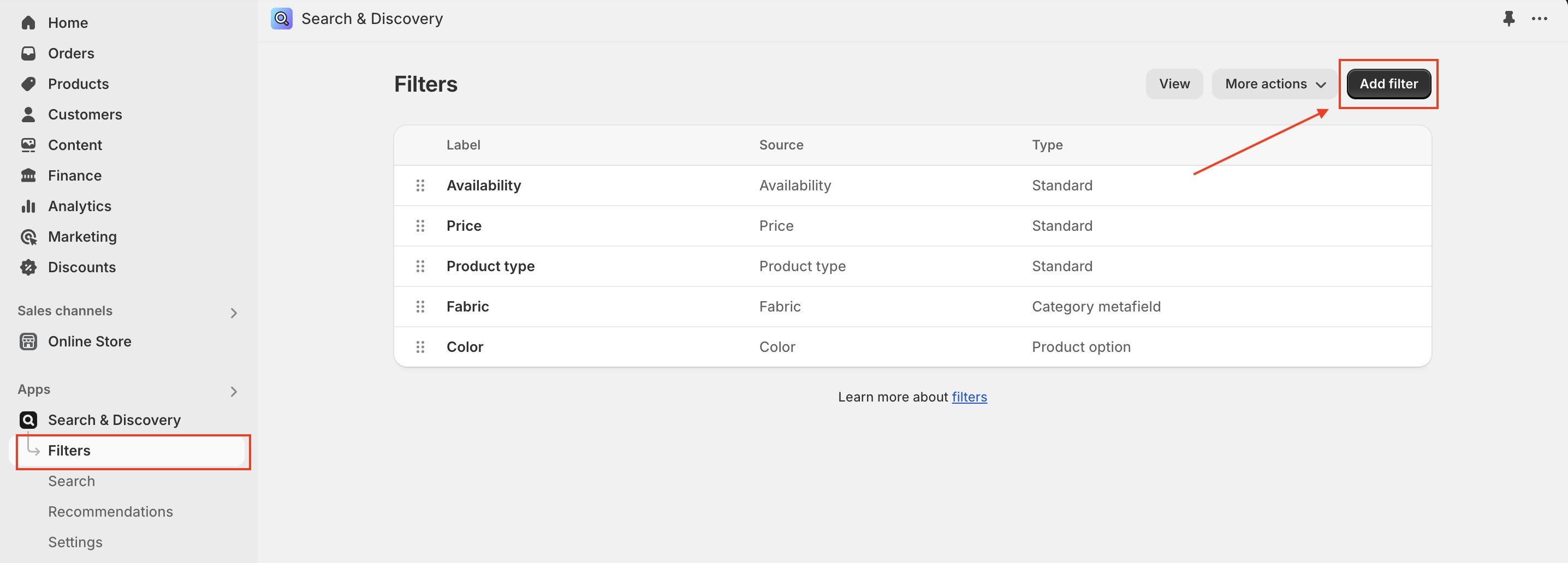
By default, the **filter drawer** includes a **price slider** and **Availability** option (screenshot).You can add more filter options with Shopify's [Search & Discovery app](https://apps.shopify.com/search-and-discovery). Steps:
* In the [Shopify Search & Discovery app](https://admin.shopify.com/apps/search-and-discovery), go to **Filters**, and then click **Add filter**.
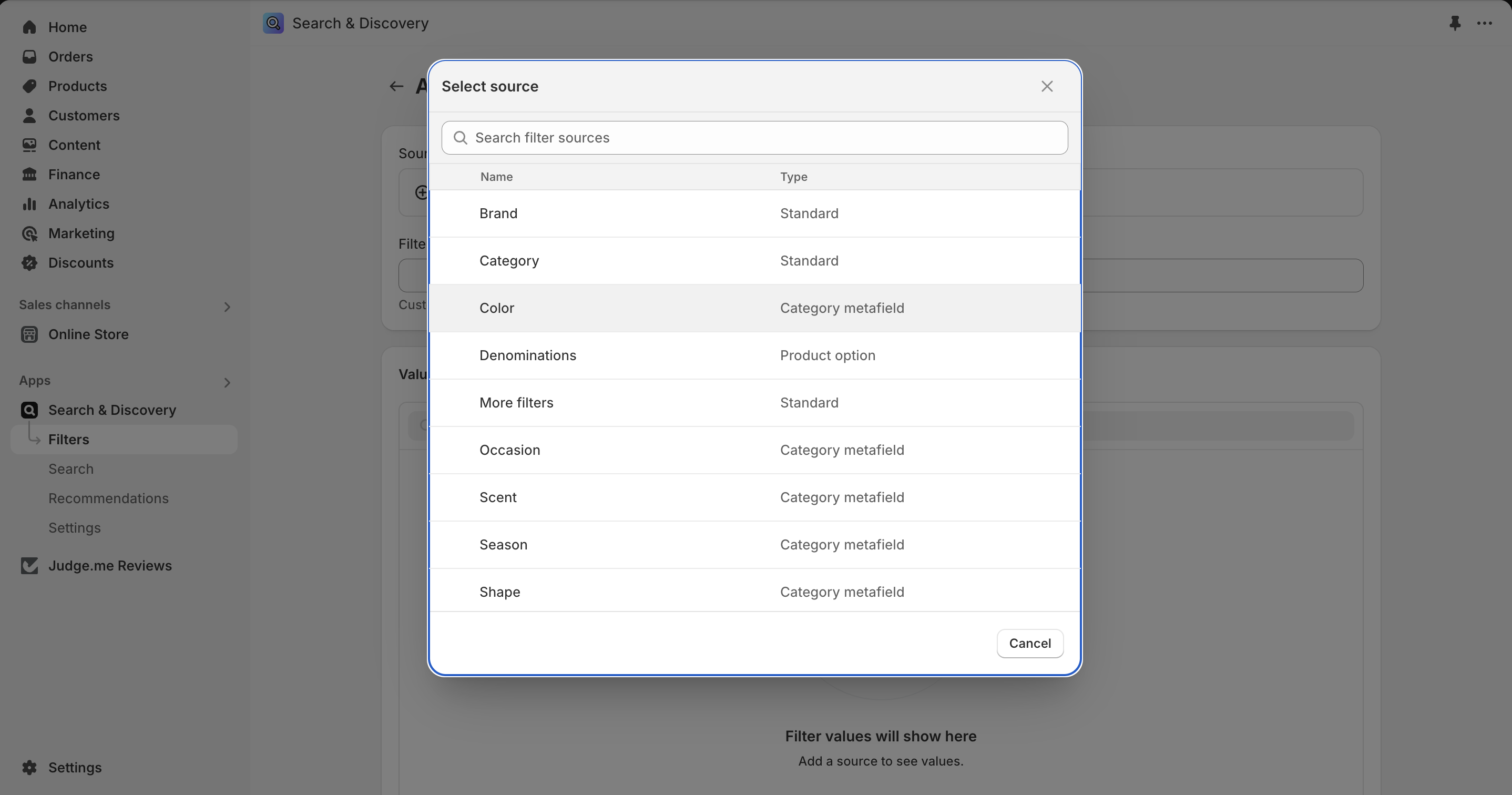
* Select a **Source** for the filter options. Sources can be variant options, tags, or metafields.
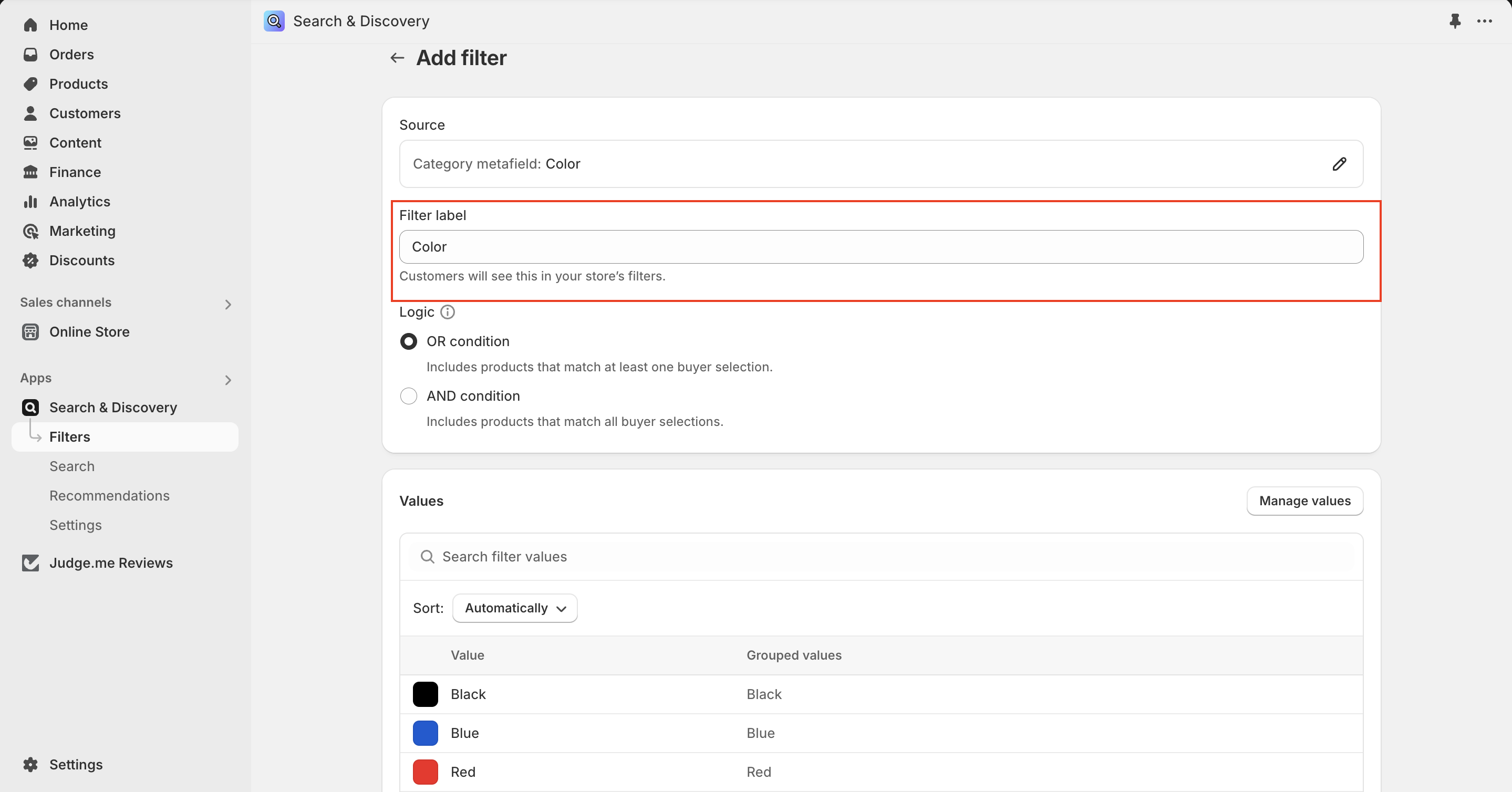
* Add a **Filter label** to change the filter group name that appears when filter is opened.
* Click **Save**.
### 2. **Promotion image** block settings:
* **Image**: Select an image to promote the **collection**.
* **Position in grid**: Choose where the block appears (1–49).
* **Desktop image width**: Determines how much space the promotion image takes up relative to other product cards in the collection.: 1 column, 2 columns or Full width
* **Text settings:**
* **Heading**: Enter a title for the promotion (e.g., “Spring Sale” or “New Arrivals”).
* **Heading size**: Select from *Small, Medium, or Large* font sizes.
* **Description**: Add supporting text below the heading.
* **Content position**: Adjust content placement within the image: Middle left, Middle center, Middle right, Bottom left, Bottom center, Bottom right.
* **Button settings**: Customize the button label, assign link and select button style.
* **Mobile layout:**
* **Mobile image width**: Control how a **promotion image** appears within the product grid on mobile devices: the image spans **one column** or stretches across **two columns**, occupying the **full width** of the screen.
---
# Agent Instructions
This documentation is published with GitBook. GitBook is the documentation platform designed so that both humans and AI agents can read, navigate, and reason over technical content effectively. Learn more at gitbook.com.
## Querying This Documentation
If you need additional information that is not directly available in this page, you can query the documentation dynamically by asking a question.
Perform an HTTP GET request on the current page URL with the `ask` query parameter, and the optional `goal` query parameter:
```
GET https://help.byinspiredlabs.com/collection-page/product-grid.md?ask=&goal=
```
`ask` is the immediate question: it should be specific, self-contained, and written in natural language.
`goal` is optional and describes the broader end goal you are ultimately trying to accomplish on behalf of the user. GitBook uses it to tailor the answer towards what is most useful for that goal.
The response will contain a direct answer to the question and relevant excerpts and sources from the documentation.
Use this mechanism when the answer is not explicitly present in the current page, you need clarification or additional context, or you want to retrieve related documentation sections.